

Adding
Features
Introduction
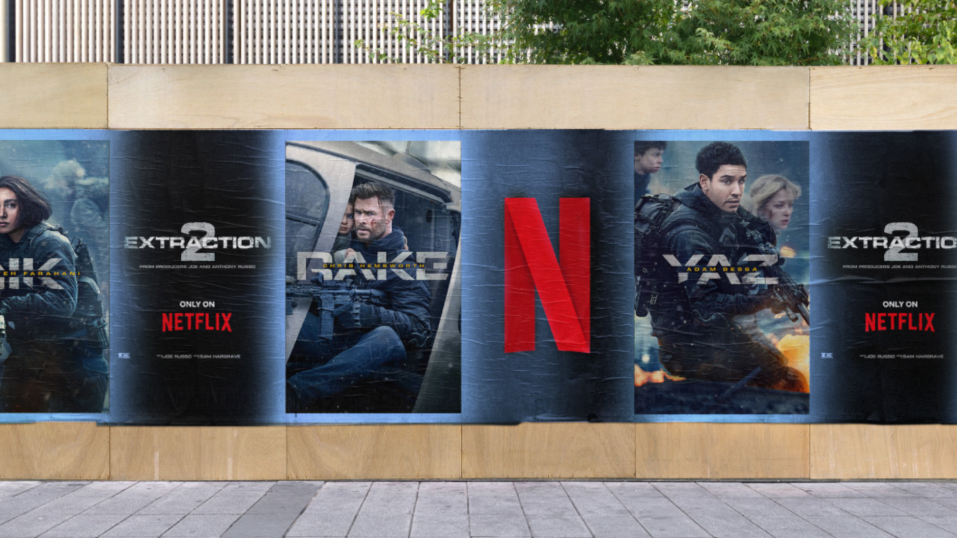
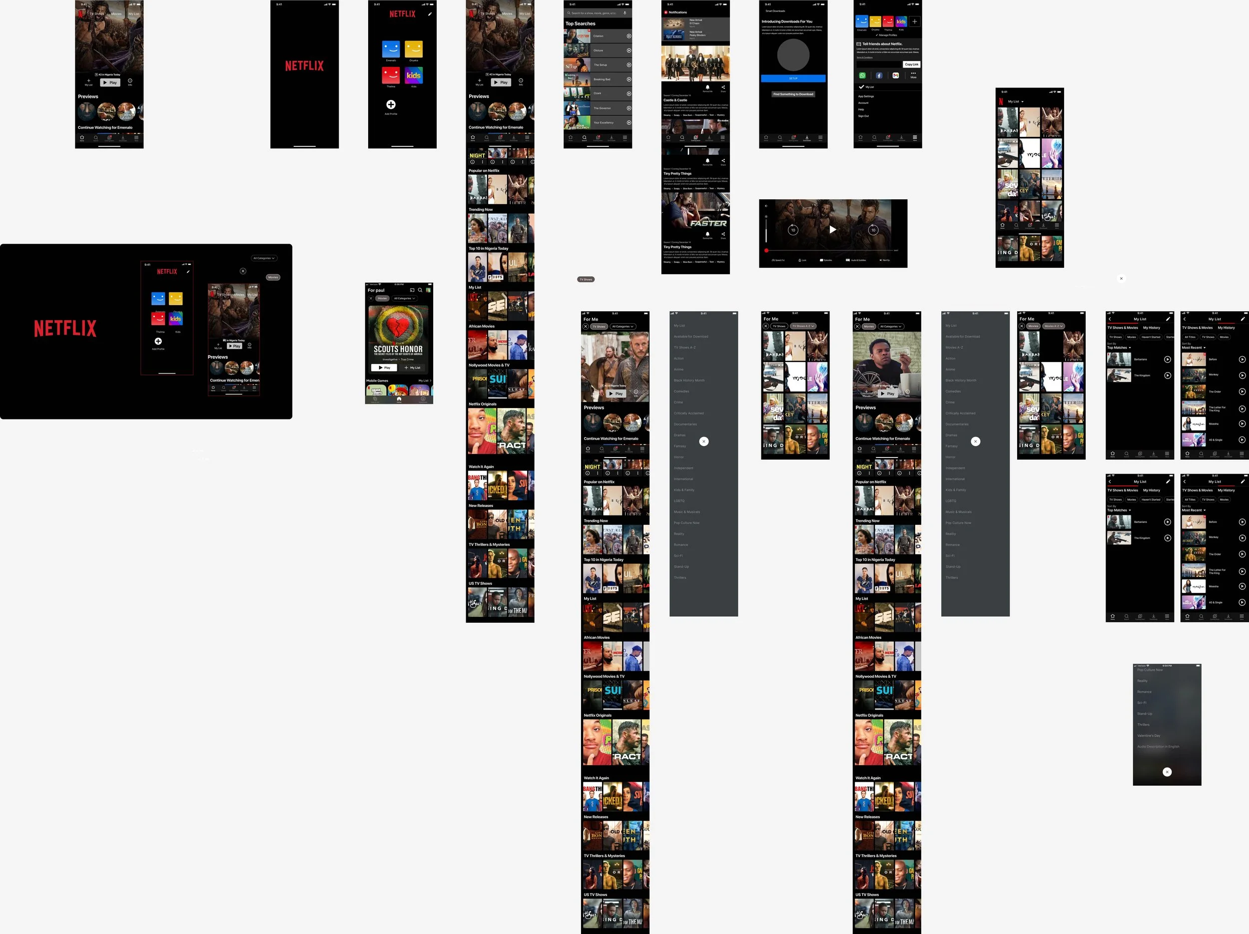
In this case study I was tasked with adding two features to an existing property. I decided to tackle the streaming giant Netflix, as I had noted some features, during my personal use of the app, that I had wished Netflix would implement. The features I thought Netflix was lacking the most were the following:
Watch History - An easily accessible watch history section
A-Z - A way for users to see Netflix’s extensive catalog.

Interviews
Although I had some ideas and theories of what features other’s would enjoy, I decided that user interviews would be the best way to determine whether I moved forward with my hypothesis. I interviewed five regular users of Netflix, and asked them a series of questions designed to help unveil whether I was on the right track. I wanted to make sure that I wasn’t guiding them towards answers, or conclusions, that would support my theories, and I tried to let the interviews feel more like an organic conversation. It yielded interesting results that ultimately, and thankfully, seemed to strengthen my initial thoughts on the project.
A-Z Feature- This concept was appealing, if not very appealing, to everyone that I interviewed. The algorithm’s in Netflix’s app seems suggests to its users a select few titles, while the rest of it’s vast library is ignored. The people I interviewed seemed aware of this, and it seemed to be a common complaint.
Watch History- While not as enthusiastic as the “A-Z” feature, the “Watch History” concept was also held its water when mentioned in the interviews. One interesting use that came to light during my conversation with a mother, was it’s potential to help parent’s monitor what their children were watching.
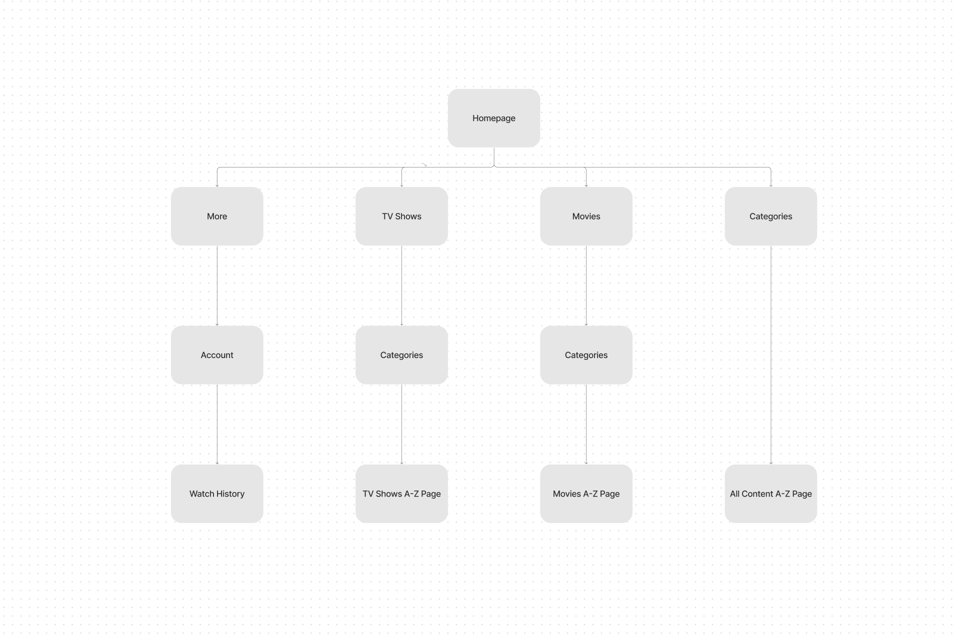
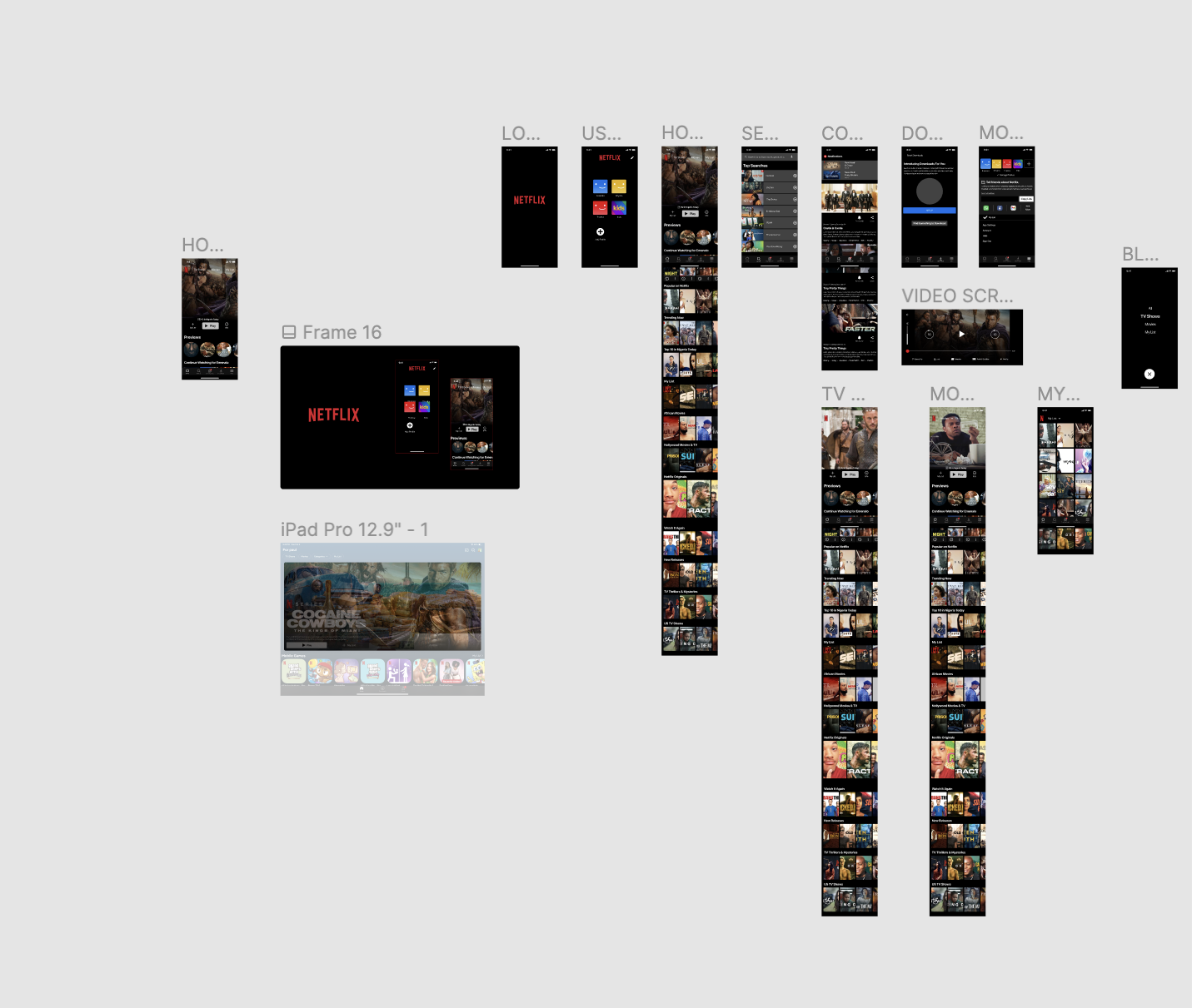
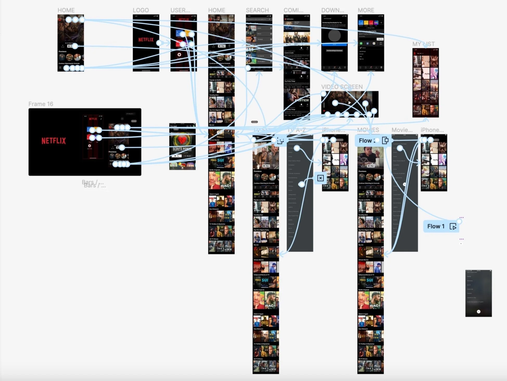
Tools and Methods
After the research and interviews I organized my thoughts by utilizing tools I had learned in my UX/UI training during my time at Designlab. I created a roadmap, personas, and conducted a competitive analysis of similar sites.
Design Process
After I had my plan worked out, I started working on designing Papergirl Plants site. Cori already had a logo designed by a local graphic designer so I decided to contact her and get permission. I then designed a hero image, and conversed with Cori about color choices, fonts and overall aesthetics. Afterward she approved I continued with the project and created the user interface.
Usability Testing
Once my prototype was completed I found five participants to test my designs usability. The test consisted of locating the categories, navigating the site to the stems section, selecting two items, and finally adding said item to the users commissions list.
The test was a success in all cases. My flows seemed to work perfectly well. After the test was over I had a series of follow-up questions which revealed some iterations that needed addressing.
Iterations
Through my own observations and the suggestions given to me by my testers, I added the following changes to my project.
-Fixing the add to cart button it is more obvious that something has been added
-Fixed spacing issues for clarity
-Make the categories section more obvious
What’s Next?
I have a really great start, and now it is time to see it to fruition.
I will be spending a lot of time writing blurbs about each and every type of plant and flower featured on the site. Since this will be a tool for Cori to use and update, I will also be showing her how to update everything herself so she won’t have to rely on anybody else.
These next steps are unfamiliar territory, but the same was true for everything when I started this project. I love to learn, and I am excited to keep doing so.
