Papergirl Plants
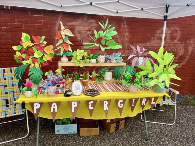
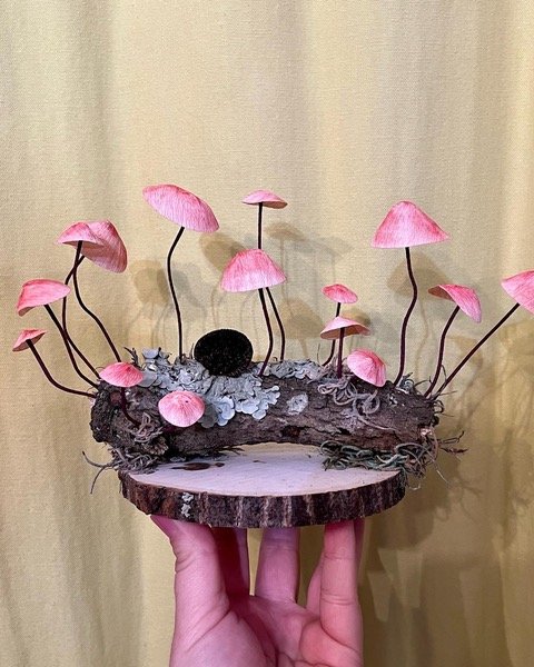
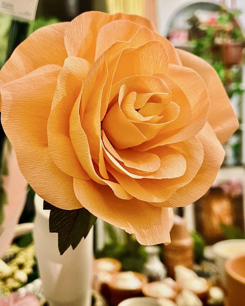
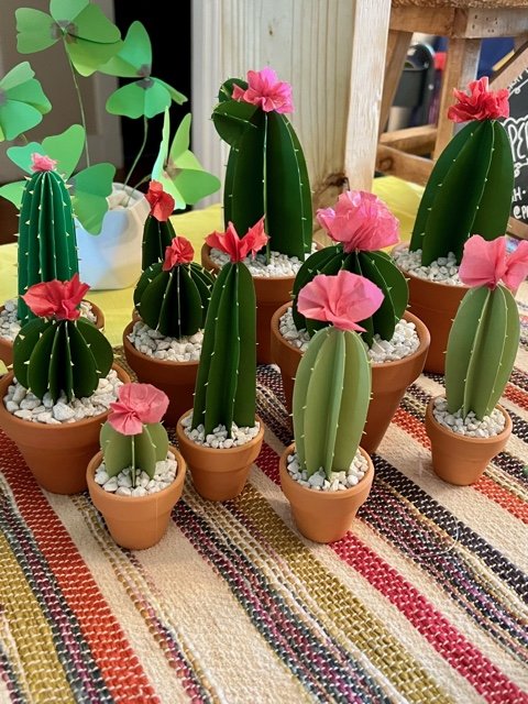
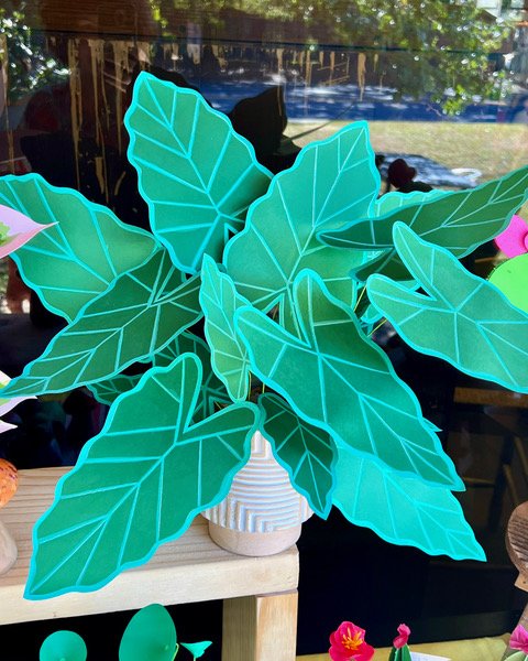
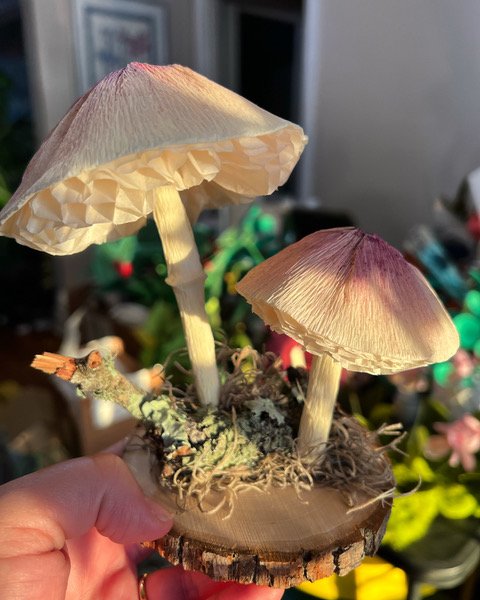
Handcrafted paper flora
Creating an app for a local business.
PROJECT TYPE
Student Project
RESPONSIBILITIES
User Research
Wireframing
Prototyping
Usability Testing
TOOLS
Figma
DURATION
80 Hours
Overview
I approached Cori about designing her website after realizing this local artist did not have a website. I have known Cori since high school and have personally bought her products at local markets. We had a meeting and came up with a game plan. She had some great ideas, and our individual visions seemed to line up with each others nicely.
The Problem
Cori’s main source of profits comes from participating in local Saturday markets, and while these go fairly well, she is looking for ways to communicate with costumers outside of these events, and expand her brand.
Gallery Section- Cori and the participants want to see a gallery section that shows off her products.
Commissions- Though initially hesitant Cori eventually liked the idea of the site being a commission based site after being informed that her clients all sited this as something they would be interested in.
News- Due to Cori mainly selling at local markets, an updatable news section that informs customers of when and where Papergirl Plants will be is vital to her business. This became clear as the interviews went on.
The Solution
Background
Methodologies
Research
Being a customer of Papergirl Plants, In knew what I wanted from Cori’s, but I wanted to know what Cori, and other’s want. To accomplish this I decided to use competitive analysis, and a series of interviews.
Evaluate the business owner’s needs, and the needs and wants of Papergirl Plants’ patrons.
Identify the pain points of Papergirl Plants’ current business strategy, and see what improvements could be made.
Discover what costumers would want from a Papergirl Plant app.
Research similar companies, and identify how they tackle these issues.
Discover what these companies do well, and where they could use improvement.
Competitive Analysis
Competitive analysis is used to show the strengths, and weaknesses in different websites, or apps, and to take that information in account so that we might improve upon these designs to enhance our product. The following sites were chosen because they are well known sites that provide similar functions, and have proven popular, with a well-structured design.
Etsy
Ono
Mr. Beast
Etsy is one of the largest platforms for artists, makers, vintage stores, and various other small businesses, on the internet today. It has a clean aesthetic with an easy to understand navigation. It may not be a perfect match for analysis simply because it is a massive site that works more as a platform for people to post their latest wares, but it does offer some good information on how to design flows that are easy to understand.
Ono is a sustainable, zero waste food delivery service. The website has a sleek minimalist design that feels clean and inviting. It has a ton of well used animations and transitions. The color palette uses neutral colors and muted colors. This makes the food and products really pop. I chose this website to analyze because it has such a good vibe and really showcases a well thought out branding.
Mr Beast is an apparel and accessory website and mobile app. Moving banners with bright colors swirl throughout the site. Every section of the website almost feels like its own unique design, font and layout. It somehow manages to balance the chaos, and doesn’t allow it to overwhelm the merchandise, or confuse the audience about how the website works. It is a great example of how to have fun with your website, and not compromise its purpose.
Client Interview
I had an in depth interview with Cori (owner) to figure out what she would like to see in her app, and any other features she would like to be available for both her and the costumers.
During my sit-down interview with Cori there were several features and functions that she revealed she wanted.
Requested Features/Functions
Gallery Section - A section with all current and past work.
Contact/Commision - A section that would allow Cori to be talk directly with her customers.
News - An area of the app dedicated to market locations, and other pertinent information or changes that might occur.
User Interviews
In addition to the client interview, I also conducted interviews with five of Papergirl Plants costumers. Some, but not all of the questions I asked were as follows:
What are your shopping habits?
What, if any, retail websites do you use?
What about these sites do you like?
Is there anything you wish they offered, but don’t
When you first saw Cori’s products was were your initial thoughts?
Why did you ultimately purchase one of her plants?
Research Results
The following are the commonalities and pain points that were revealed during my conversations.
All interviewees were drawn into Cori’s plants by her aesthetically pleasing shop and by the quality of her products.
Three participants sited one reason for purchasing was to due to not being able to keep plants alive. One of the three told me that their cats destroy living plants.
All five said that they have purchased Papergirl products as gifts for other people.
Everyone agreed that they will shop with her again
Most of them use online shopping, but came across Papergirl Plants either randomly at a local market or through instagram.
Personas
I created two personas that reflected the pain points, and motivations that presented themselves during my research
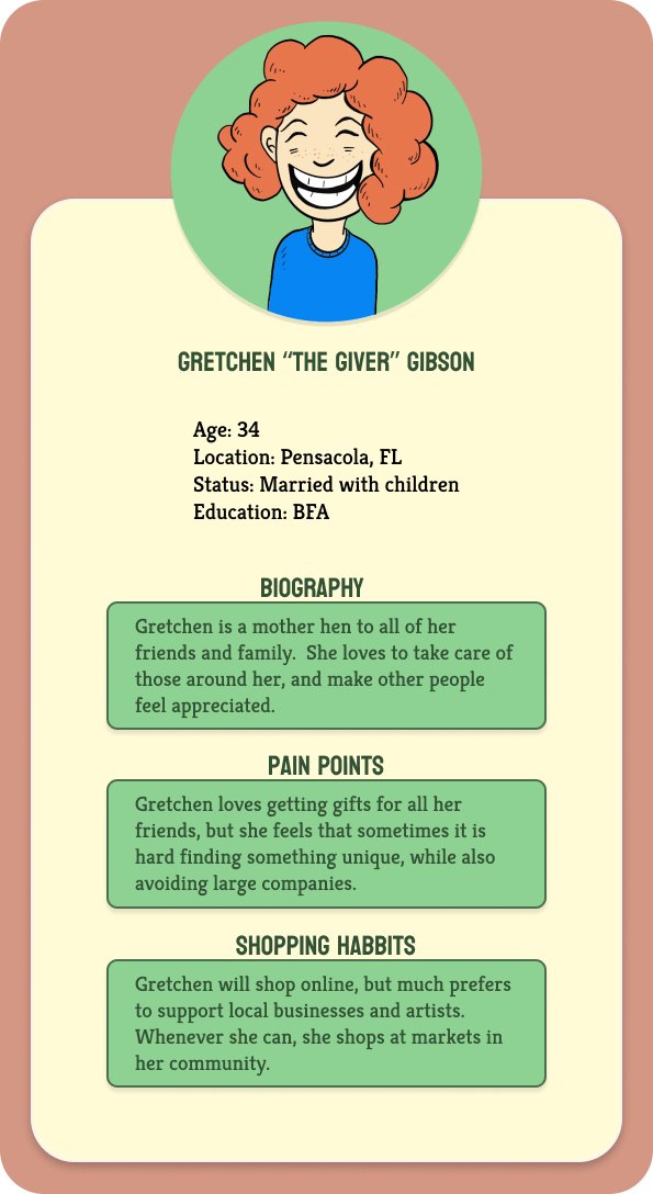
The first persona I created focuses on the gift giver that is looking for unique handcrafted gifts.
The second persona reflects on the busybody, that that just can’t seem to keep any plants alive.
Design Process
My research revealed some interesting directions to head in. I started the design process by creating a project roadmap, separating the most important features, from ones that would be nice to have, or could be implemented at a later date.
Site Map
Although I include the “Commission/Contact” and the “My Process” sections in my sitemap, Cori informed me that these sections are ones she would like to have, but ultimately, she wasn’t ready to implement. We decided to hold off on these two for the moment. I added it to the map for my own benefit.
Components
I had a large amount of images and components to work with.
Cori informed me that she had commissioned a logo design through a local graphic design company Cando. I conducted a short phone interview with them to get permission to alter the original design for the purposes of the app.
She also sent me over 40 reference photos of both past and current works. She also gave me titles, descriptions and pricing of each individual item.
During our discussions we decided that she a vintage postcard look for the homepage that incorporates the original logo would fit the brand nicely. I created this image using Procreate and Adobe Creative Suite.
After compiling all my assets and components I began mapping out my wireframes.
I started by mapping out the basic design set up, and spacing. All of these early decisions would prove useful, but also allowed for adjustments both large and small.
I used a textured paper scan for the background, this gave the app a playful feel and helped enhance the vintage feel. I then started to plug in the components and assets.
I added the descriptions and pricing to the detail pages. I also created a dropdown menu that allows the user to easily access the checkout and categories.
Wireframes
Final Prototype
With all my features added I tested out my creation and felt it worked well. I was anxious to try it out on Cori and some volunteers.
Usability Testing
Once my prototype was completed I found five participants to test my designs usability. The test consisted of locating the categories, navigating the site to the stems section, selecting two items, and finally adding both items to the users cart list.
The test was a success in all cases. My flows seemed to work perfectly well. After the test was over I had a series of follow-up questions which revealed some iterations that needed addressing.
Iterations
Through my own observations and the suggestions given to me by my testers, I added the following changes to my project.
-Fixing the add to cart button it is more obvious that something has been added
-Fixed spacing issues for clarity
-Make the categories section more obvious
I have a really great start, and now it is time to see it to fruition.
I will be spending a lot of time writing blurbs about each and every type of plant and flower featured on the site. Since this will be a tool for Cori to use and update, I will also be showing her how to update everything herself so she won’t have to rely on anybody else.
These next steps are unfamiliar territory, but the same was true for everything when I started this project. I love to learn, and I am excited to keep doing so.


